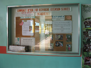
BOARD DISPLAYS EVALUATION FORM
Topic of the Board Display COMMUNITY
ACTION FOR RESPONSIVE EXTENSION SERVICES
Location of the Board Display in
School HALL WAY near school entrance
Check the column that
indicates your rating. Write comments to back up your ratings. 4-Outstanding,
3-Very Satisfactory, 2-Satisfactory, 1- Needs Improvement.
|
|||||
Criteria
|
N1
1
|
S
2
|
VS
3
|
O
4
|
Comments
|
Effective Communication Conveys the
message quickly and clearly
|
/
|
It has effective communication to
the readers, from topic to means it is clear and understandable to everyone.
|
|||
Attractiveness
Colors and arrangement catch and
hold interest.
|
/
|
The color is simple it defines the
topic which being kind to everyone. The arrangement catch and hold interest
because it indicates with outcomes with program.
|
|||
Balance
Objects are arranged so stability is
perceived.
|
/
|
The letters, pictures, and verses
well arranged easy to read and understand.
|
|||
Unity
Repeated shapes or colors or use of
boarders holds display together.
|
/
|
It has great “unity” it will even
connect to your real life once you read every single word they put their.
|
|||
Interactivity
The style and approach entice
learners to be Involve.
|
/
|
Since that the topic is Community
Action for Responsive Extension Services(CARES) for me it is really enticing
because it is great to have this program, very overwhelming that some think
for helping others.
|
|||
Legibility
Letters and illustration can be seen
from a good distance.
|
/
|
Yes Letters and illustration can be
seen
Easily considering that the location
of this bulletin is in the hall way
|
|||
Correctness
Free from grammar errors, misspelled
words, and ambiguity.
|
/
|
Everything written there is free
from any corrections.
|
|||
Durability
Well-constructed, items are securely
attached.
|
/
|
Yes it is durable, From bulletin
board to items.
|
|||
An
Evaluation Report of a Bulletin Board
(Option
2)
Bulletin Board Evaluated by: Analyn
Rayon Ramoso
|
||
Location: Pilgrim college
|
||
Brief description of the Bulletin
Board: Great bulletin “it’s opens
every mind that we as individual has connection with each other”
|
||
EVALUATION
|
||
Strength
|
Weaknesses
|
|
Description
of the bulletin Board lay-out
|
Well
constructed, easy access to the individual. It calls the attention to
everybody to get involve.
|
If it is
not maintained clean and legible to everybody that bulletin will be useless.
And it will not function to its target.
|
Evaluation of educational content.
And other aspects:
|
The content of this bulletin board
shows that it is good being think for others and think less for yourself.
Share and it will come back to you hundred folds. Since sharing is loving. It
even touches the three domains which cognitive, affective, psychomotor.
Cognitive being thinking for other, affective the sense of helping through
volunteerism, psychomotor because it exerts effort.
|
If everyone does not response with
the content of this bulletin
|
Recommendations or Suggestions for improvement: the
color background must be more enticing.
|
||
Signature of Evaluator: Analyn R.
Ramoso
|
||
My
Analysis
Did the
board display design reflect the likes/interests of its target audience?
Why? Why
not? Yes, the board display design reflect the likes or interest of its
target because it is eyes friendly the arrangement of its information are well
organize according to their means and functions. We will get interested by the
attitude of these board because you can find there the evidence or on how these
program works, how they reach those people who are the recipient of this
program they also indicate their different activity with connection to their
topic Community Action for Responsive Extension Services.
Was the
language used clear and simple for the target audience to understand?
Why? Why
not? Yes the language used is clear and easy to understand to the targets,
reader friendly you don’t need to use for dictionary to look for what does that
board says…and for putting there the pictures regarding the activity its more
likely to understand to everyone.
What do
you think was the purpose of the board display? Was it effective?
Why? Why
not?
For me,
and for the information I got there where I conducted my observation, the
school really wanted to include one of their programs to extend hand to the community,
to get involve what the needs of the
community. And it makes my heart bursting that some schools organizing this
kind of program to train our students or learners to share to others every
blessing we have. With this I believe that we will still have the hope of
country, “think less for self think big for others” even if it start with
little things it means a lot to whom touch and reach for it. It is more than
effective because the purpose that board really function well.

